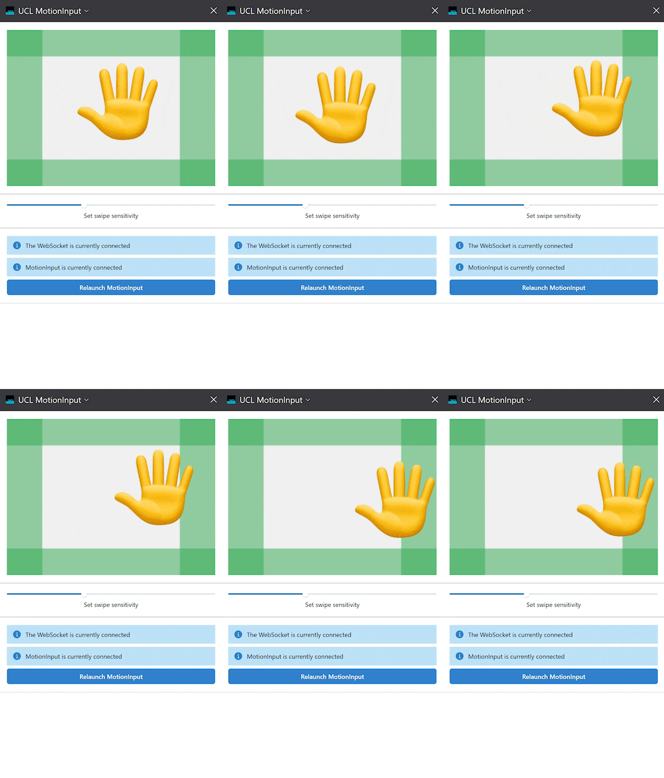
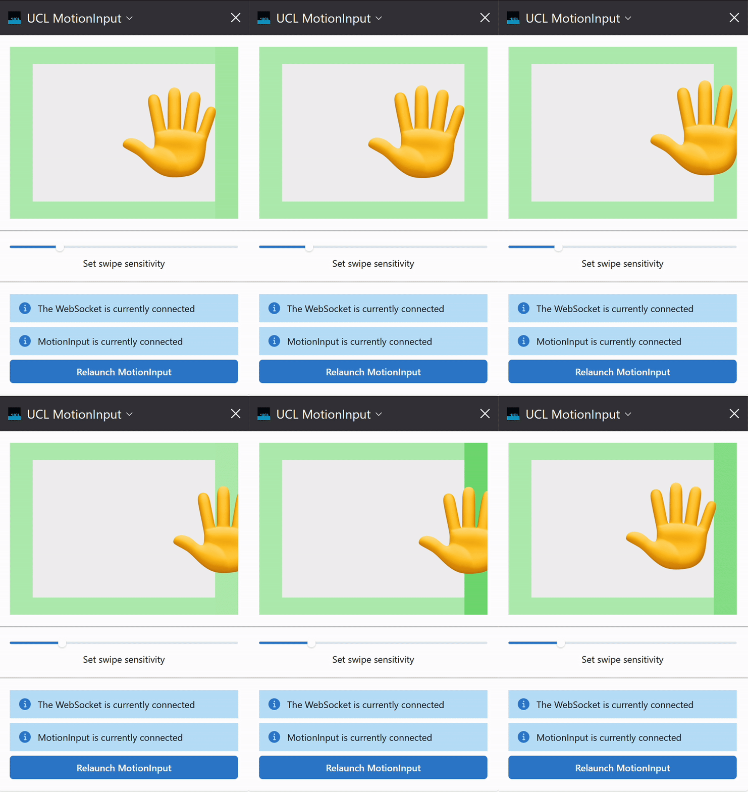
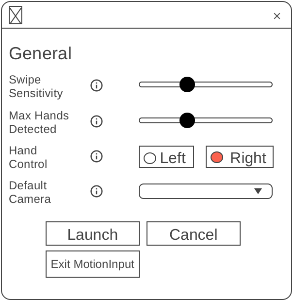
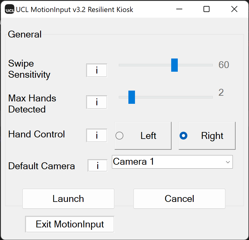
Overview of experimental & final user interface designs.

UI Design

Overview

A. Overview
One of our project's main goals is to enhance the user experience when using kiosks. We want to change how users interact with kiosks by replacing touch-based controls with touchless technology. This change may be difficult for some users, so we aim to make the transition as easy as possible by designing the user interface in a user-friendly manner. We worked on this throughout the project, making improvements and adjustments along the way.

Our project consists of two UI components:
-> Kiosk Web-Extension (used by the end-user).
-> Kiosk Backend Launcher (used by the admin to start the software).

B. Gesture Input
When designing the input for the kiosk, we had three major concerns. As our project aimed to solve accessibility issues, we wanted to ensure that the gestures required were not too difficult to achieve in terms of amplitude and finesse. At the same time, the gestures needed to be recognizable enough to avoid frequent misidentification. Lastly, we wanted to prevent user frustration.

To address these concerns, we decided to map common touching interactions with MI gestures. For example, in hand gesture mode, finger swipe was replaced by hand swipe movement, and clicking was replaced by clicking in the air. By using similarities between these gestures and their counterparts, we believe we can reduce user frustration when adapting to the new UI of the kiosk.
C. GUI and User Feedback
Our original intent was to not make any additions to the original kiosk GUI once the application was launched, to minimize interference with kiosk users. However, during one of our tests, we found that the interaction was painful. Unlike when using their hands directly, users would need feedback from the kiosk to track their own gestures. We decided to show an abstract hand image together with the checking thresholds of the MI in the corner of the screen, to help users notice and understand how the UI works. Since most kiosks will have blank spaces on their GUI, we felt that this addition to the original GUI was acceptable.

Web Extension

Sketch
We used the gathered requirements to design a sketch of the web extension. This allowed us to quickly come up with a design and improve on it before we started working on our first prototype.

Initial Design
We made the first version of our prototype based on the design ideas depicted in the earlier sketches. This prototype was used for showcasing our designs to potential users, who were able to interact with them and provide valuable feedback. This process also enabled us to evaluate the feasibility of our design decisions and make necessary improvements to the interface going forward. We got the following feedback from our initial prototype:

-> The dark-coloured corners misled our users into thinking that they performed some particular function.
-> The users were not getting proper feedback after a swipe was triggered.

Final Design
We made the changes based on the feedback that we received and produced the final version of the web extension.

-> The dark-coloured corners have been removed.
-> The respective edge gets highlighted to provide feedback to the user whenever a swipe is triggered.

Backend Launcher (MFC)

Sketch & Design
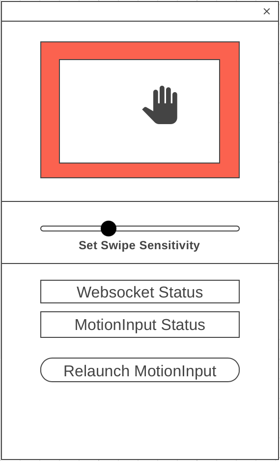
Our team created a launcher for MotionInput, intended for use by staff or administrators to set desired settings and launch the software. We developed this launcher towards the end of the project when our design and requirements were well-defined. Initially, we sketched out the design, and then we proceeded to develop the final version.